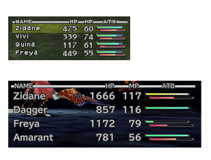
I'm not a UI/UX expert, these are just observations with unfiltered thoughts that I typed as I painstakenly crop these things. Anything I speculate on has zero evidence, I cannot read the minds of the UI designers/programmers.
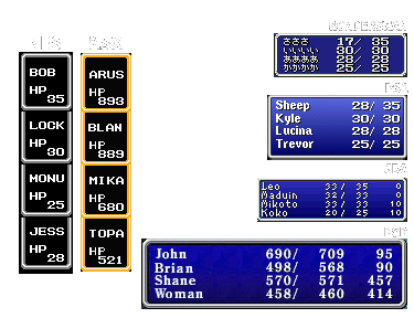
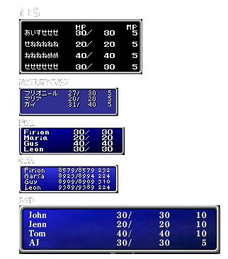
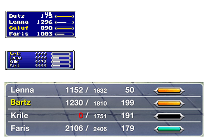
- FF1/2 both have the Max HP aligned to the right side leaving space for up for max digits. Interesting that it's persisted into the mobile versions. Wonder if it's just a classic preservation thing vs something just left in the base engine of Wonderswan version since forever.
- FF2 PS1 version doesn't bother with MP yet the Wonderswan did and had less room to work with. FF1 doesn't get MP display til GBA.
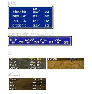
- The unreleased FF3 wonderswan is a very different version from any other FF wonderswan version. The only magazine scans show you targeting a monster so it's unknown if the party status is actually that minimal, but it's fair to say probably.
- FF3 DS seems to go for the FF8 approach of being transparent as possible albeit with a transparent black box, it's at this point the max HP actually aligns from presumbly the slash, branching off from FF1/2
- FF3 DS also has the background top aligned with how many party members there are.
- UI fonts and aesthetics were really good in the DS era...
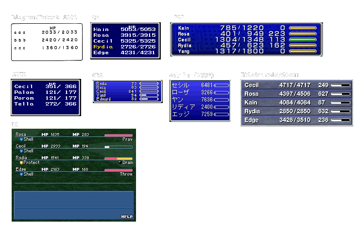
- FF4 is just a rabbit hole of ports, didn't know there was a wonderswan version, didn't know there was a Japan 2009 mobile one (before smart phone). Don't think there's a difference between SNES/Anthology(PS1) so I stopped adding anthology shots.
- It's easy to forget FF4 doesn't actually have an ATB display in the earlier versions. Also that you get 5 party members.
- Also does anyone actually realize there was a patent for the battle system that explicitly goes into detail just how the ATB works and diagrams of the interface and how the cartridge fundementally makes it happen? Still weird to me. Doesn't even really involve the "bar" initially.
- Speaking of the patent diagram, it does show that they demonstrate things with the max digits in mind.
- FF4DS goes crazy with using the entire bottom screen estate, it doesn't really need half of it given there's a help screen at the bottom at all times. Compared to all the contempory+later ports this seems to be the most forward thinking, buffs/debuff display, cast bar timers with current action.
- The PSP remakes typically have both the classic blue skin combined with transparency. A blend between classic and modern.
- The fonts on the ios/android versions are embarassing.
- FF5 mobile, those ATB bars are YIKES. Worth noting the current HP is bigger than max HP.
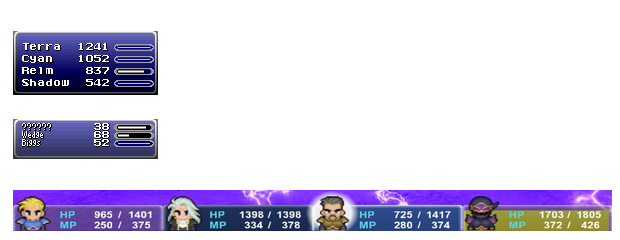
- FF6 is the first game to ditch the "HP" label (maybe why SNES has a weird top gap?). Then FF7 said lets bring it back, then FF8 said fuck all of it. Maybe because FF7 was being pushed heavily in foreign markets? (First FF game released in europe, FF hadn't made an impact in USA yet) Even going as far to label MP to maybe ease new RPG players. Ultimately though I think the transition from SNES to PS1 meant very little thought to how to minimalize and just add what to what they had.
- FF6 Mobile is where they decided to take some actual ...liberties... on the same level as FF4DS. Gives me a Mother 3 vibes (or a callback to FF3 Wonderswan? that's a stretch). The commands and actions pop up under the character panels when relevant. This seems to be taking advantage of the horizontal estate phones often have.
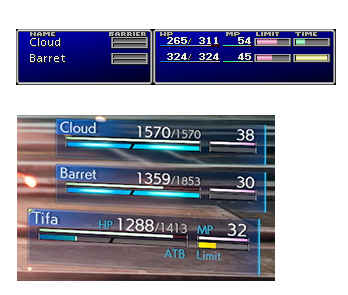
- More interesting about FF7 is how little has changed and how much was added. Same background blue gradient, bars under numbers, limit bar, barrier, every bar having a label, character panel taking up the entire width of the screen.
- FF7 Remake actually does preserve some of the bar color choices though swapped around (limit -> mp, time -> limit, hp -> action). Even the HP bar under the number is preserved. Interesting to note it uses the same "current hp is bigger than max hp" evident in the FF5 Mobile.
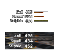
- Mentioned before but FF8 is probably the most minimal up to this point (FF1 NES being up there) and is when Square obviously relooked what was absolutely necessary to display. Most of it comes down to the contextual "you'll see it when you need to see it" which I think was largely successful. Think my only gripe was not always knowing what the exact status effect was called even though there were effects on the characters.
- The contextual nature of the UI is where I start to wonder if a single screenshot is enough, for example casting a Guardian Force will display its name with a windowed background. Though I think the general layout is enough to cover as I think the majority of RPGs in this time period were still pretty static
- Interesting to think that the limit break triggering at low health feature was a way to bypass needing an extra bar, could be the other way around but who knows. MP is also not a thing in this game so don't need that taking up space.
- So we're back to labeling but keeping the transparency and adding semi-transparent back to whoever's selected. The limit bar is also back but isn't labeled. I really like the overlapping of the bars and the color choices remind me of FFT.
- The space between character names and information widen a lot in the HD ports. Bars are really thin for some reason yet there's a lot of excess space anyway. The whole point of the overlapping bars is to save space and to make it distinct from each other. With higher resolutions some choices can make previous choices seem redundant. It's a mixed bag.
